If you’ve ever looked at a VOC reading on an air quality monitor and wondered why it shows an index number instead of a concentration, you’re not alone. Most consumer air quality monitors on the market (including those powered by sensors from Sensirion and Bosch, which between them supply the vast majority of the industry) report VOC as an index rather than an absolute value. It’s a source of regular confusion, and if you want to understand why indexes are used in the first place, I’ve written about that separately:
For now, the short version: Sensirion describes their VOC Index like this:
“The VOC Index describes the current VOC status in a room relative to the sensor’s recent history. In this way, the VOC Index behaves like a human nose. Assuming that we are entering a room from outside, our nose will use the air composition outside the room as an offset (baseline) and provide us with feedback if it recognizes higher or lower levels of VOCs when entering the room. The VOC Index performs a similar calculation by using a moving average over the past 24 hours (called the ‘learning time’) as offset.”
That last part - the learning time - is what I was interested to look into further and what I want to discuss today. Depending on the device you’re using, learning period is configurable, and changing it has a significant effect (but not as significant as I would’ve guessed) on what your sensor actually reports. To find out how significant, I ran three identical monitors using an SGP41 side-by-side for about five weeks, each set to a different learning period.
Sanity check
I set up three AirGradient monitors, each using a Sensirion SGP41, in the same room (within 15cm of each other), and ran them side-by-side. I first wanted to establish a baseline by doing a reproducibility check. When each of the three sensors is set to the same learning period, do they agree?
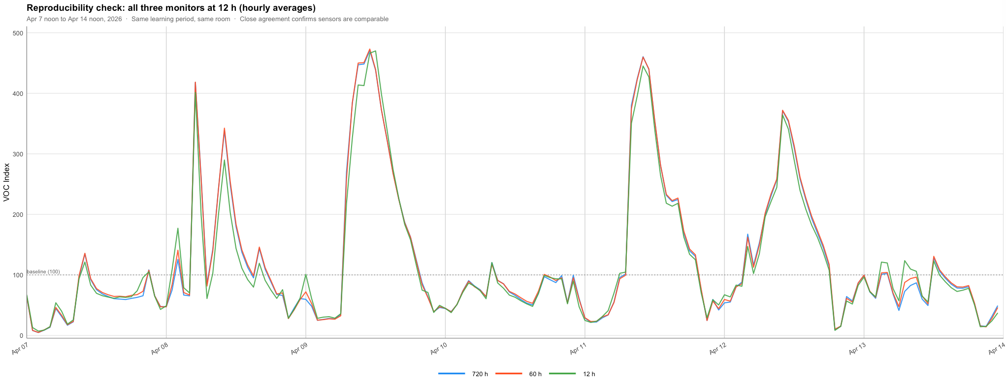
The answer is yes. In fact, they agree so well that it’s hard to differentiate between the lines at some points. Please note that while the data is labelled as 720 h, 60 h and 12 h, the monitors were all set to use a 12-hour learning period for this week-long test. These are just labelled as such so you can see they are the same monitors.
So, with that out of the way, let’s get started.
The setup
With the monitors still colocated, I then changed the learning period for two of the monitors. Please note that the only difference between them was the VOC learning period setting: 12 hours, 60 hours, and 720 hours. Everything else between the devices was identical. Below is a graph that shows the daily averages from the three monitors over one month.
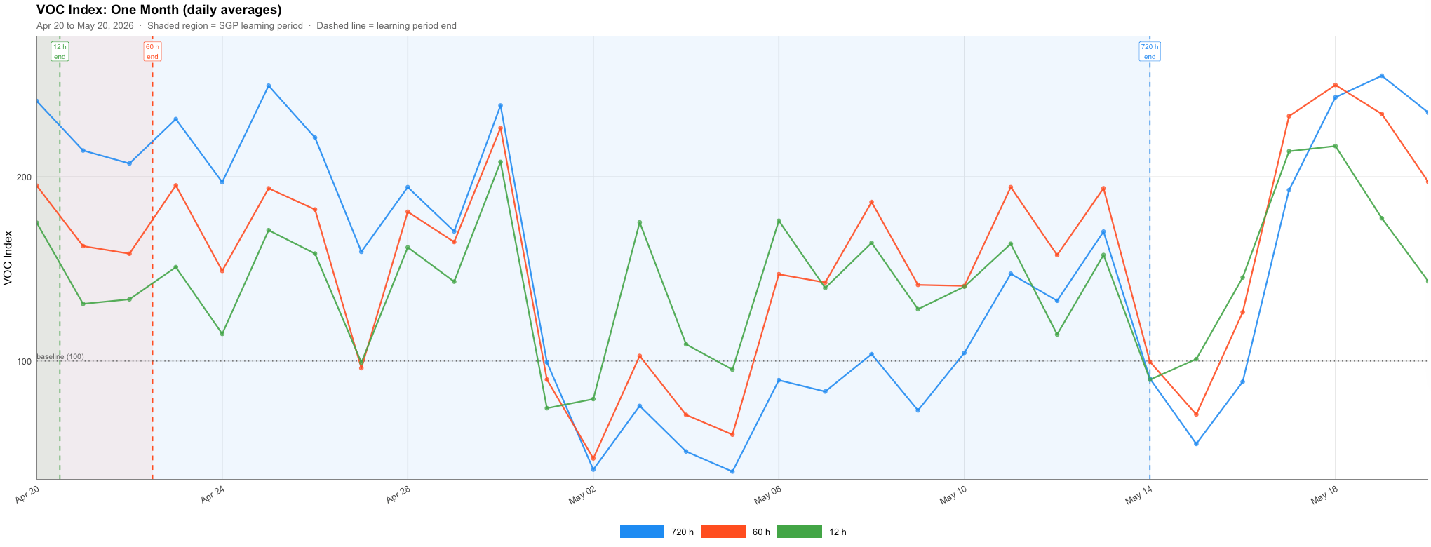
This graph shows measurements from each of the three monitors. The shaded areas indicate when one full learning cycle completed. The one-month learning period ended on May 14th, as I began this experiment on April 14th.
At first glance the three monitors broadly agree. They rise and fall together, responding to the same events, which is reassuring as it tells you the sensors are all still capable of identifying the same peaks and troughs, even when the baseline is adjusted. However, look more carefully and there is a bit more to the picture.
The sensors agree on what happened, but not how significant it was.
The data makes it clear that all three monitors detect the same events at the same time. When VOC levels rise in the room, all three respond within minutes of each other. The learning period looks to have essentially no effect on how quickly a sensor detects a spike.
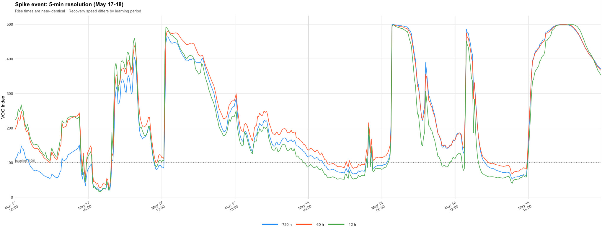
This two-day window (one of the more eventful periods in the dataset) shows the three sensors rising in lockstep. The peaks arrive simultaneously. What differs is what happens on the way back down. The 12-hour monitor returns toward baseline faster than the other two, consistently. This is the learning period doing what it’s supposed to do, as a shorter history means the baseline is closer to current conditions, so the index drops back to 100 (the baseline) more quickly once the event passes.
A shorter history means the algorithm is constantly re-anchoring to recent air quality, so once an event clears, it has less distance to travel back to its own reference point.
The inversion
However, based on the graph above, the recovery speed is still a relatively subtle difference. The more dramatic finding only becomes visible when you zoom out and look at the gap between sensors over the full month.
For the first two weeks, the 720-hour monitor reads consistently higher than the 12-hour monitor - sometimes by more than 80 index points. Then, in early May, it inverts. The 720-hour sensor drops below the 12-hour sensor by as much as 100 points, in the same room, with the same air. By the end of the month it has partially recovered, but the gap remains erratic.
A swing of 180 index points over the course of a month, in a sensor reporting on a 0–500 scale, is significant. If you were using these readings to make decisions such as running an air purifier or deciding whether to open a window, the two sensors would be telling you quite different stories about the same air quality.
Why it happened
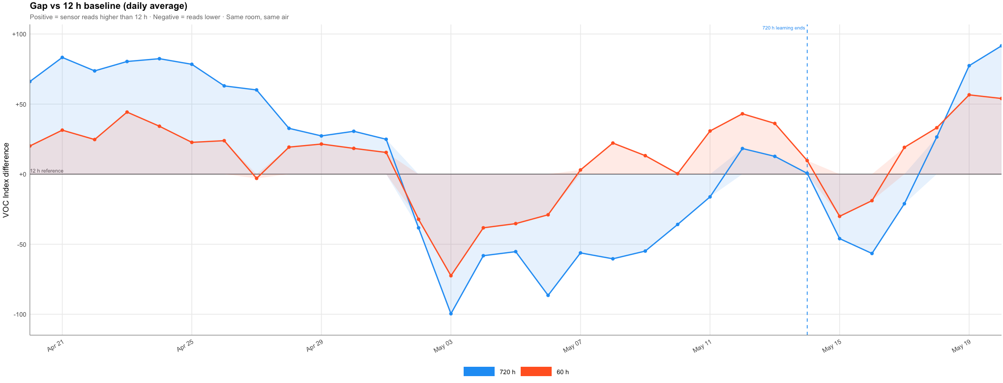
The overnight floor chart makes the cause clearer. Rather than looking at all readings across the day, this strips out the hours with human activity and looks only at what each sensor reports in the small hours of the morning. Overnight levels can still vary significantly, but by removing the daytime events, the changes in each sensor’s baseline becomes easier to see.
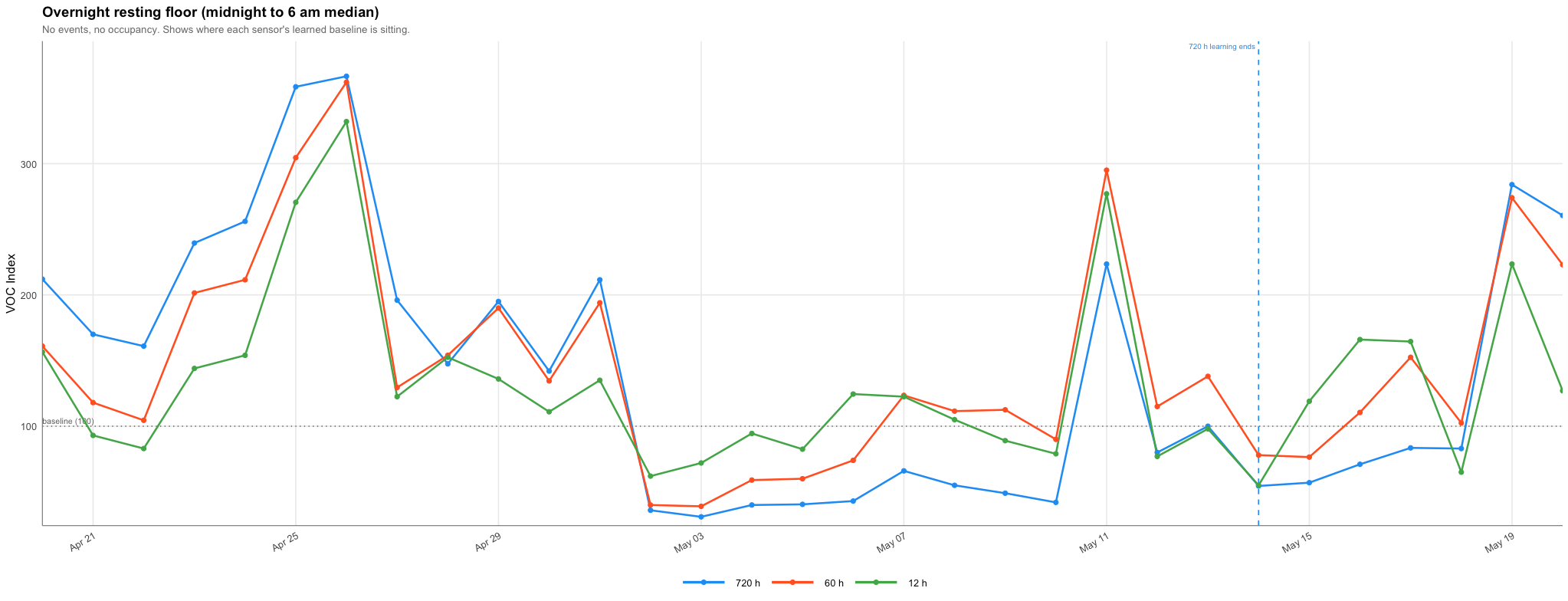
This is particularly interesting because it aligns with what was happening in our home. For the first 10 days or so, we were at home every day. From the 1st of May, we travelled and didn’t come back until the 14th of May. The 12-hour sensor’s baseline kept pace with the recent conditions, anchoring itself to whatever the last twelve hours looked like. The 720-hour sensor, still in its learning phase, kept incorporating those elevated readings from before we left into its long-run average. For that time when we were away, the average was already set so high that ordinary air registered as below its learned normal.
This is the core difference with longer learning periods in variable environments. The sensor isn’t anchored to recent conditions, but rather to the average of everything it has seen, including the busiest and most polluting days. Depending on what you’re trying to monitor, this could be helpful or detrimental.
What this data looks like in the most recent week
Zooming into the final seven days of the dataset gives a cleaner view of the three sensors after they had all gone through at least one learning period.
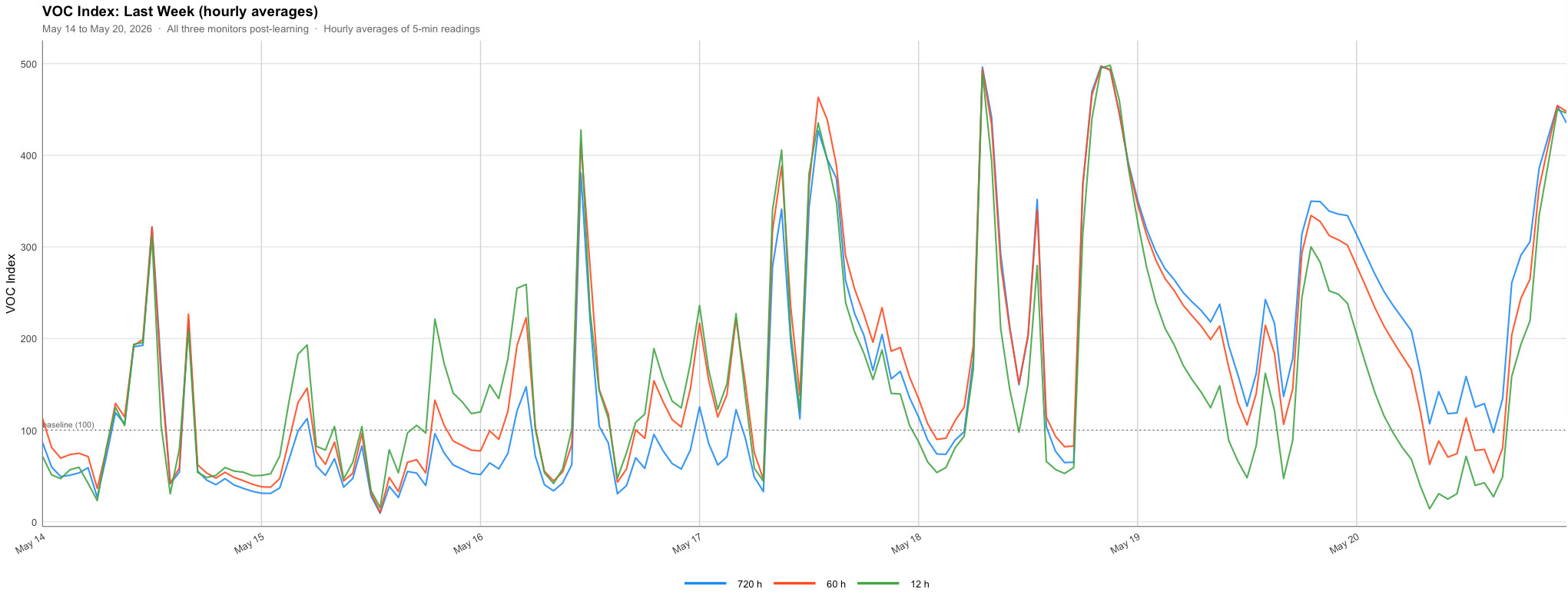
The monitors are more closely aligned here than they were earlier in the month, but some differences remain, particularly when it comes to how much the deviate from the baseline (at least during smaller changes). However, I’m frankly quite surprised at how similar the readings from each sensor are.
What this means if you’re choosing a setting
The intuitive assumption is that a longer learning period produces a more reliable baseline (this was my hypothesis before seeing these results! more data, better reference point. The reality is more nuanced. In a stable, low-variability environment, a longer learning period probably does produce a better baseline. But in a typical home, where VOC levels swing dramatically based on cooking, cleaning, and ventilation, a long learning window might not be as useful.
After looking at these results, I would say that the safest general advice is to use a shorter learning period unless you have a specific reason to expect a highly stable VOC environment,